Now that we have obtained historical price data through the API in Tutorial 2, let's add a technical indicator. The Moving Average Convergence/Divergence indicator is one of the basic and most effective momentum indicators available, according to stockcharts.com. The common graphic representation of this indicator consists of three ingredients:
- The MACD line, which is calculated as the difference between the short- and long-term exponential moving average of the price (usually taken at windows of 12 and 26 respectively).
- The signal line. which is computed as the exponential moving average of the of the MACD line, usually set at a window of 9.
- The MACD histogram, which represents the difference between the MACD line and the signal line.
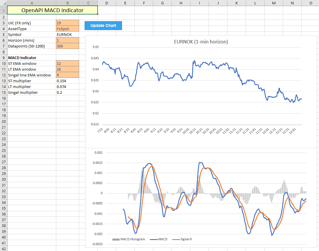
Starting from the functionality developed in Tutorial 2, this tutorial adds two new parts:
- Additional VBA to dynamically compute all the MACD values depending on the input parameters (the 'regular' MACD is set up as 12-26-9).
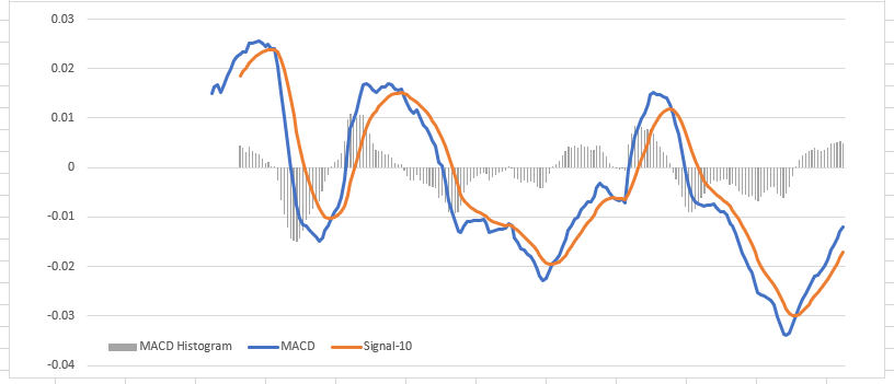
- A new graph, which is located at the bottom to display MACD values:
VBA implementation
The VBA code used to pull historic prices from the OpenAPI has been re-purposed and can be found in the earlier tutorial. All data has been moved to a separate sheet to keep the chart overview clean and uncluttered. This spreadsheet contains a couple extra input fields:
- The exponential moving average parameters for the short-term window, the long-term window, and the signal line.
- Computed multiplier values, based off the input windows for the exponential moving averages.
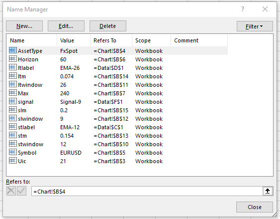
To make the VBA code more readable, cell names are used similarly to how they were employed in the previous tutorial. This workbook has a substantial list of named cells, which encode all required input variables to dynamically update the MACD datapoints.
As for the VBA code itself, the following sections contain key points which guarantee dynamic functionality for computing the EMA values, taking into account that the start- and end locations of series for the computed values can change depending on the input parameters. The below code ensures all datapoints are computed at the correct locations, primarily through dynamically assigning values to ranges by row numbers, which depend on the input fields stwindow, ltwindow and slwindow.
Because the EMA values are self-referencing (each next EMA data point depends on its predecessor), the starting values are set equal to the SMA with the chosen time horizon. Each next value is computed accordingly, taking the multipliers into account (which are located on the Chart tab). Because the Range.Formula method automatically updates cell references dynamically, no further work is required to ensure each next value is computed from the correct input (Excel takes care of that).
'define variables to be used for adjusting ranges
Dim stw As Integer
Dim ltw As Integer
Dim slw As Integer
stw = [stwindow]
ltw = [ltwindow]
slw = [slwindow]

'assign column names on Data tab
[stlabel] = "EMA-" & stw
[ltlabel] = "EMA-" & ltw

'compute EMA values (cells in formulas update dynamically)
Range("Data!C" & 1 + stw).Formula = "=AVERAGE(B2:B" & 1 + stw & ")"
Range("Data!D" & 1 + ltw).Formula = "=AVERAGE(B2:B" & 1 + ltw & ")"

Range("Data!C" & 2 + stw & ":C" & 1 + dmax).Formula = _
"=(B" & 2 + stw & "-C" & 1 + stw & ") * stm + C" & 1 + stw
Range("Data!D" & 2 + ltw & ":D" & 1 + dmax).Formula = _
"=(B" & 2 + ltw & "-D" & 1 + ltw & ") * ltm + D" & 1 + ltw
The next section computes the MACD datapoints:
- MACD line, as the difference between, again using the Formula method to automatically fill this to the end row. The starting point of this line is limited by the long-term EMA starting point (in the usual case, this would be data point 26).
- The signal line, which is computed in the exact same way as the EMA values above, again taking into account that the starting point of this series depends on the chosen parameter settings.
- The MACD histogram, which is simply the difference between the MACD line and the signal.
'compute MACD line value
Range("Data!E" & 1 + ltw & ":E" & 1 + dmax).Formula = _
"=C" & 1 + ltw & "-D" & 1 + ltw

'compute signal line
Range("Data!F1").Value = "Signal-" & slw
Range("Data!F" & ltw + slw).Formula = _
"=AVERAGE(E" & 1 + ltw & ":E" & ltw + slw & ")"
Range("Data!F" & 1 + ltw + slw & ":F" & 1 + dmax).Formula = _
"=(E" & 1 + ltw + slw & "-F" & ltw + slw & ") * slm + F" & ltw + slw

'compute MACD histogram
Range("Data!G" & ltw + slw & ":G" & 1 + dmax).Formula = _
"=E" & ltw + slw & "-F" & ltw + slw
Finally, everything is put together by assigning the new data point ranges to the charts, similarly to how this is done in the prior tutorial:
'activate price chart, assign refreshed data, change chart title
ActiveSheet.ChartObjects("Price Chart").Activate
ActiveChart.SetSourceData Source:=DataCells
ChartTitle = [Symbol] & " (" & [Horizon] & "-min horizon)"
ActiveChart.SeriesCollection(1).Name = ChartTitle

'activate MACD chart and asssign data
ActiveSheet.ChartObjects("MACD").Activate
ActiveChart.SetSourceData Source:=Range("Data!A1:A" & 1 + dmax & ",Data!E1:G" & 1 + dmax)
Sanity check
In order to confirm whether the chart generated by the Excel implementation is legit, it is straightforward to compare it against a price chart from SaxoTraderGO. Consider the following case:
- The instrument in question is the Swiss Franc / Norwegian Kroner cross.
- Horizon of this study is set to 1 hour, with the last 10 days as historic data.
- MACD parameters are set to the slightly unusual 15, 40, 10 (to deviate from the standard 12, 26, 9).
GO displays the following MACD graph:
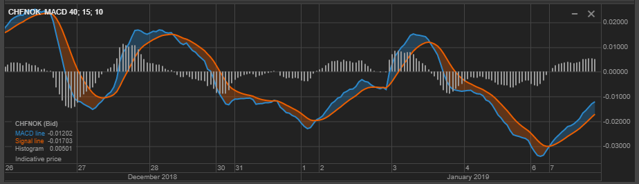
Which indeed follows the graph computed by the Excel implementation: